
Bokus Play
The power of looking cheap
The joy of reading is for everyone. The value of design is indisputable. When Bokus Play entered the audiobook market a timid approach was not an option. After twenty plus years of being a trusted and affordable online bookstore for the swedes, the audiobook branch Bokus Play was stepping out into stiff competition. Together we created a vibrant new sister identity, fully kinetic and fit for any screen. The identity would have to hit the ground running in terms of branded asset production, adaptable enough for the marketing dept to quickly try out and evaluate any and all media, while looking constantly perfect.
Our Assignment
Visual identity
Motion design
2D animation
Motion templates
Copywriting

Look at me! I’m charged with a playful, simplistic, and to-the-point personality.
The Bokus Play design world — with its colors, logo, design assets, and moves — is ready to be poured into any format from day one. Books should be available to all, no matter how or when you read. Looking at what IKEA did for homebodies and how Comviq found a way to send out loud and clear low-price-vibes using just a few brush strokes, we built a sturdy branding toolbox to signal availability and nice price.
Bokus Play is a brand designed to move, with a high-energy color palette and playful typesetting. The folded corner serves as a recognizable token of forward movement.
With an enormous catalog of audiobooks and ebooks at the best price on the market Bokus Play greets the people mobile first.
Since creating and developing the identity and design world for Bokus Play we have continued to help Bokus with versatile campaign designs and second to none templating to keep the momentum going.


-
![]()
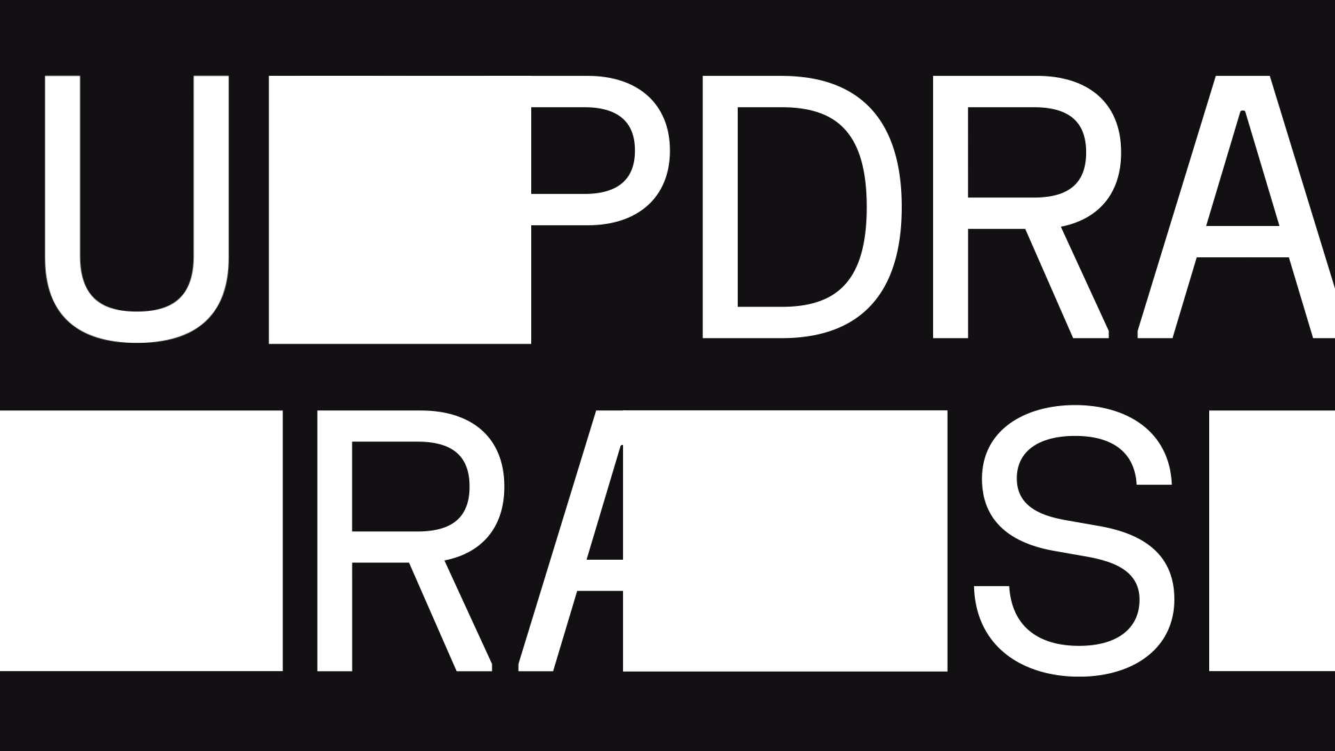
All caps, no secrets
Never afraid to ask the hard questions, peeling off layers of smoke and mirrors, Sweden's number one investigative show Uppdrag Granskning is stepping into a new, more versatile outfit.
-
![]()
Long live Melodifestivalen
From vintage iconic logo to live show graphics, to new iterations of iconic logo, to sudden bursts of glitter, to brassy awards, to smooth wipes, to gleeful guidelines and custom dust — we take Melodifestivalen’s branded ride through the decades very, very seriously, safeguarding the brand's integrity as the biggest live broadcast event in Scandinavia.
-
![]()
Dedication, courage and type
In search of the polished timelessness the highest global diplomacy demands, we opted for a restrained design to frame an extraordinary story, leaving the screen open for grander characters.
-
![]()
Looks and smarts
Swedish public service documentary and science tv channel Kunskapskanalen was longing for a complete redesign.
-
![]()
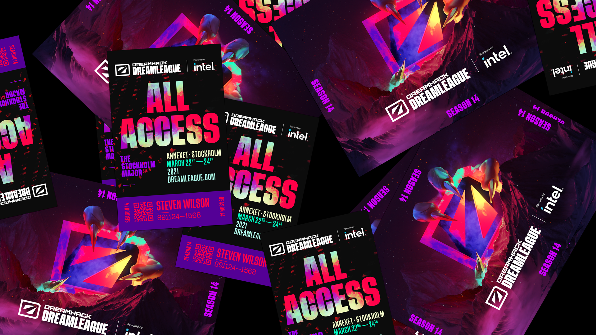
The dust never settles
The new DreamLeague identity is made to move, celebrating DreamHack’s remarkable 25 year devotion to bringing people together to play and create.